Tuesday 20 October 2009

The Bermuda Triangle

I have been given the Bermuda Triangle as an unusual place to represent typographically. Below is a quick 10 min sketch of how I think the font could look like taking the word 'triangle' at face value. The Bermuda Triangle is a place of disappearing ships/planes so I want to experiment by fading out the type.

On top of the World - working in Illustrator

I have begun to vectorize my initial sketches. I bent a series of lines to make up a grid that replicates
the curvature of the earth. I want to have two versions of this typeface, one with the lines of the grid
running through each character and one without.


German Luftwaffe Font

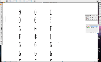
I am currently developing this typeface for the type led postcard brief. I came across a font used by designer Joe Gilmore called Schablonenschrift A. It was used by the German Luftwaffe during the second world war.


Unfortunately I couldn't get hold of a Schablonenschrift A 'tiff file' so I have attempted to replicate the
letter forms.


To avoid getting my ass sued I have changed the amount of negative space between the joins of each
letter. Some characters such as the 'K', 'T' and so on have been changed from the original.


I used a roll of thread to draw round for rounded edges.


Starting to vectorize the typeface in Adobe Illustrator.


After Effects Session 1 (Expressions)

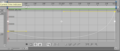
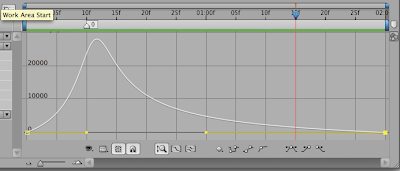
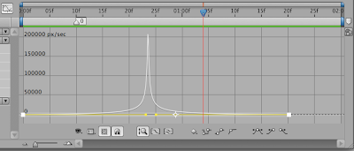
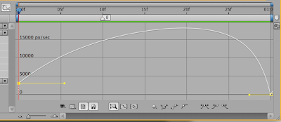
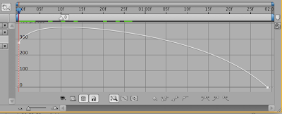
Manipulating the 'graph editor' to change the speed of an object moving across the screen.


Fast acceleration > break hard > slowly accelerate.


Fast acceleration > break slowly back to position.


Really fast acceleration > break slowly back to position.

Monday 19 October 2009

Affter Effects Session 1 (Expressions)

During the days lesson I learnt how to change the speed between two key frames using 'easy keys'.


Easy Ease = starts off slow and picks up speed.
Select keyframes then go to animation > keyframe assistant > easy ease.


The 'Graph Editor' above shows that the higher the line the faster an object with travel. This can be manipulated to change the speed and distance an object can move by moving the yellow points representing the two keyframes.


Easy ease example.


Easy Ease In = starts off fast and slows down.
Select keyframes then go to animation > keyframe assistant > easy ease in.


The 'Graph Editor' above shows that the object started off travelling at a fast speed and gradually slowed down.


Easy ease in example.

Tuesday 13 October 2009

On top of the World

The phrase 'on top of the world' came from someone suggesting the earths axis as an unusual place. I got thinking about longitude and latitude and found this nifty image of the longitude and latitude of the world.


Initial sketches


Each letter (in theory) is bent to a 30 degree angle left and right from the centre. I will vectorize all of the letterforms. I want to somehow keep the grid and the map to make the connection between the phrase and the typeface.


Don't Panic Postcard Brief

This brief will be combined with a personal project on creating a set of typefaces based on unusual places. The list of unusual places I am currently working with are as follows; Area 51, in a computer screen, bermuda triangle, on top of the world, chernobyl, back ally of Nando's and Karl Cartwright's hair.


Design a postcard based on traditional postcard design to be sent from an unusual place and time.

Initial Sketches / Mock Up's

I want the promotional pack for ArjoWiggings paper range to have the same dimensions as a 7 Inch vinyl. Having it 7"x 7" means it would fit easily through a letter box. I have designed it so the package is one sheet of card that folds into itself and holds ArjoWiggings paper samples.


Initial sketches.


Package mock up's based on a 7" vinyl.


Turn head clockwise to see a very basic net.


PROMOTIONAL PACK WILL NOT CONTAIN A 7" VINYL.


PROMOTIONAL PACK WILL NOT CONTAIN A 7" VINYL.


PROMOTIONAL PACK WILL NOT CONTAIN A 7" VINYL.


The package will have a angled fold on one of it's edges (it's a design feature).


In order to open the package you will have to cut through a sticker that will be stuck around the edge holding the package together. This will also act as security when posting out.


ArjoWiggins Brief

Using any uncoated paper or papers from the ArjoWiggings fine papers range, design a promotional piece encouraging graphic designer to regard paper as a key design element.

Leeds Public Art Brief

Produce a print based publication using the text provided along with photographs taken.

Final Resolutions

Front cover


Contents page


Flow chart


Double page spread number one


Double page spread number two

Grid & Front Cover

I am working collaboratively with Kevin Knott on the Leeds Public Art Project. We initially came up with a few sketches on how we want to layout the predetermined text and images.


We came up with a 3x3 column grid and a 400mm x 145mm double page spread that when printed fits within an A3 sheet in order to minimise costs.


First attempts at applying our sketches on screen.


Front cover layouts. We both new we wanted to use a colour wheel as a focus on the front cover because it is a symbolic image that says, 'art'.


First attempts at applying our sketches on screen using an existing colour wheel as a reference to our own wheel of colour.


Front cover. Type/layout experiments.